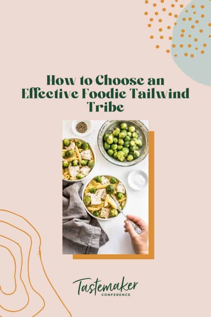
Learn how to create food pins/images that stand out and get engagement on Pinterest with these tips!
Pinterest Images Through the Years
For a long time now, food bloggers have been creating super long Pinterest graphics, usually comprised of 2-3 images and a text bar. The idea generated from a study conducted by Pinch of Yum which showed that long pins on average were getting 70% more repins than short pins. Naturally, every food blogger followed the video tutorial and created their own picture, colored text bar, picture graphics.
Fast forward three years and things have changed. A: Pinterest is saturated with these giraffe pins (that’s what a Pinterest employee called them on a webinar) and B: Pinterest has changed the way they display pins in the feed.
Pinterest has been experimenting with different pin lengths to show in the feed. They also used to have an “expand pin” overlay at the bottom for pins that were longer than their crop.
No more.
I guess that’s just part of being a blogger. Rolling with the changes. We have to adapt and adjust to keep up, even if that means learning how to get more exposure and finding a Tailwind Tribe.
If you want to keep up to date on the current sizing and best practices, be sure to check out Pinterest for Creatives Best Practices directly from Pinterest!
What’s on the To-Do List Today?
Today we are going to share a few ideas for you to consider when design your food pins. Some of these are from other food bloggers and many are from promoted pins. I have been studying promoted pins ever since Pinterest started their in house program where they create pins for high paying ad clients. Who better to learn from than Pinterest?
We hope these examples give you some inspiration and encourage you to try different styles and find what works for you. You can also read Pinterest’s suggestions for creating pins.
Designing Food Pins
An Image with No Text
Let the food do the talking. Two instances where this is a great option is: when it is very obvious what your recipe is or when your picture is so beautiful words would just ruin it.
It’s really not a bad idea all around either. Especially when you consider most people are using Pinterest to search, not browse.
As Pinterest continues to grow, search plays an increasingly important role. Search is now responsible for more on-site impressions than any other Pinner action. Pinners conduct 2 billion searches a month, primarily on mobile. Whether someone wants dinner recipes or decorating advice, Pinterest helps them find ideas and take action.
If I’m searching Mongolian beef recipe, do I really need to see a bunch of text graphics titled Mongolian beef?

Adding Text with the Image
Adding a little text for clarity will go a long way too though. All of the ideas below include some sort of text. Before we get those read these few tips on using text on your pins:
- “Text can bring your pins to life” -Pinterest
- The text on your pin does not have to be the title of your post.
- What makes your recipe different than other recipes just like it?
- “You can add headers, subheads, annotations or take a creative approach to how your type interacts with the image.” – Pinterest
- Use easy to read fonts, make sure they are big enough to see on mobile
- “The more straight forward & helpful the copy is, the better. -Pinterest
Ditch One of the Images
Maybe this one is obvious, but if you’re accustomed to doing the picture, text bar, picture thing for your pins this style will be super easy for you. Just ditch one of the pictures and have a text bar on top or beneath the image. Also super easy way to update pin graphics for old posts.
A few of the examples below were two images and I cropped to make them one.

Leave “White” Space for Text
You’ll have to think about this during the photographing stage. White space (also commonly referred to as negative space) is the empty or open space surrounding the subject of a picture or the object that defines the artwork. Negative space can be a blurred background or empty. It does not need to be the color white.

Incorporate the Text
Go ahead and get creative with your text! You don’t need stay confined to a text box, overlay, or negative space. Add playful elements like arrows, curve the text around the dish, add ingredient or or help words, or add text on top of things.

Image Collages
I’m not saying collage pins are out. You can still create them, they just need to be shorter. Collage pictures that do well: cast of characters, process or steps, or different angels.
Apparently, I have a thing for the monster of Frankenstein?

Go Create Beautiful Food Pins!
There isn’t one right way to design your images for Pinterest. Find your own style, stand out, and make it beautiful.
At Tastemaker, you’ll get lots of great tips for creating pins. With sessions on food food styling, photography editing, and Pinterest best practices you’ll have the best Pinterest graphics in all the land after learning and implementing for your blog.
One last tip, remember, “the best pins are inspiring and actionable.”
Article by: Kristie Hill
Kristie is on a mission to help bloggers start and grow their online businesses. She knows that smart bloggers don’t leave their blog’s success up to chance, they make a plan. Kristie helps bloggers DIY their WordPress sites and use tools like Pinterest to grow their online presence.
Want to Stay up to Date with all Conference Deals and Ticket Releases? Sign up for our Newsletter Below!
